Fasken

Character and minimalism
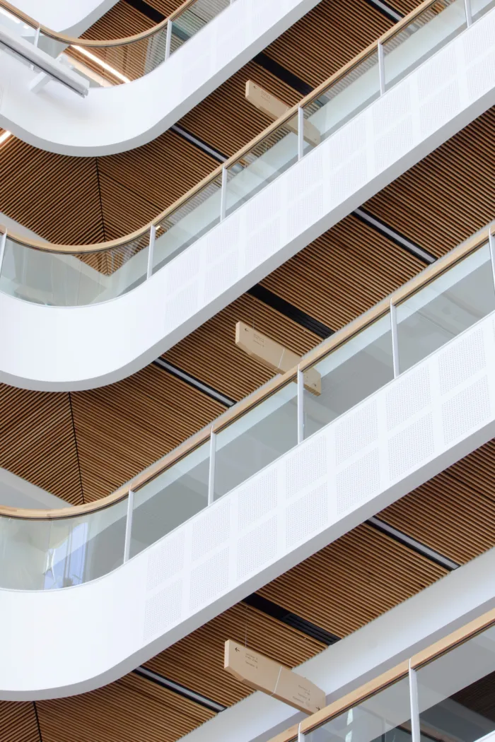
Verticality, Diagonals, and Curves: The Defining Lines of Fasken Québec’s Signage Concept.
These three lines shape the signage concept for Fasken Québec’s offices, blending elegance, precision, and warmth. Inspired by the refined, minimalist interior design, also crafted by LemayMichaud, the signage elements embody a unique yet understated personality, subtly echoing the law firm’s brand identity.
This design philosophy extends to the pictograms, each one meticulously custom-designed to convey clarity and sophistication.
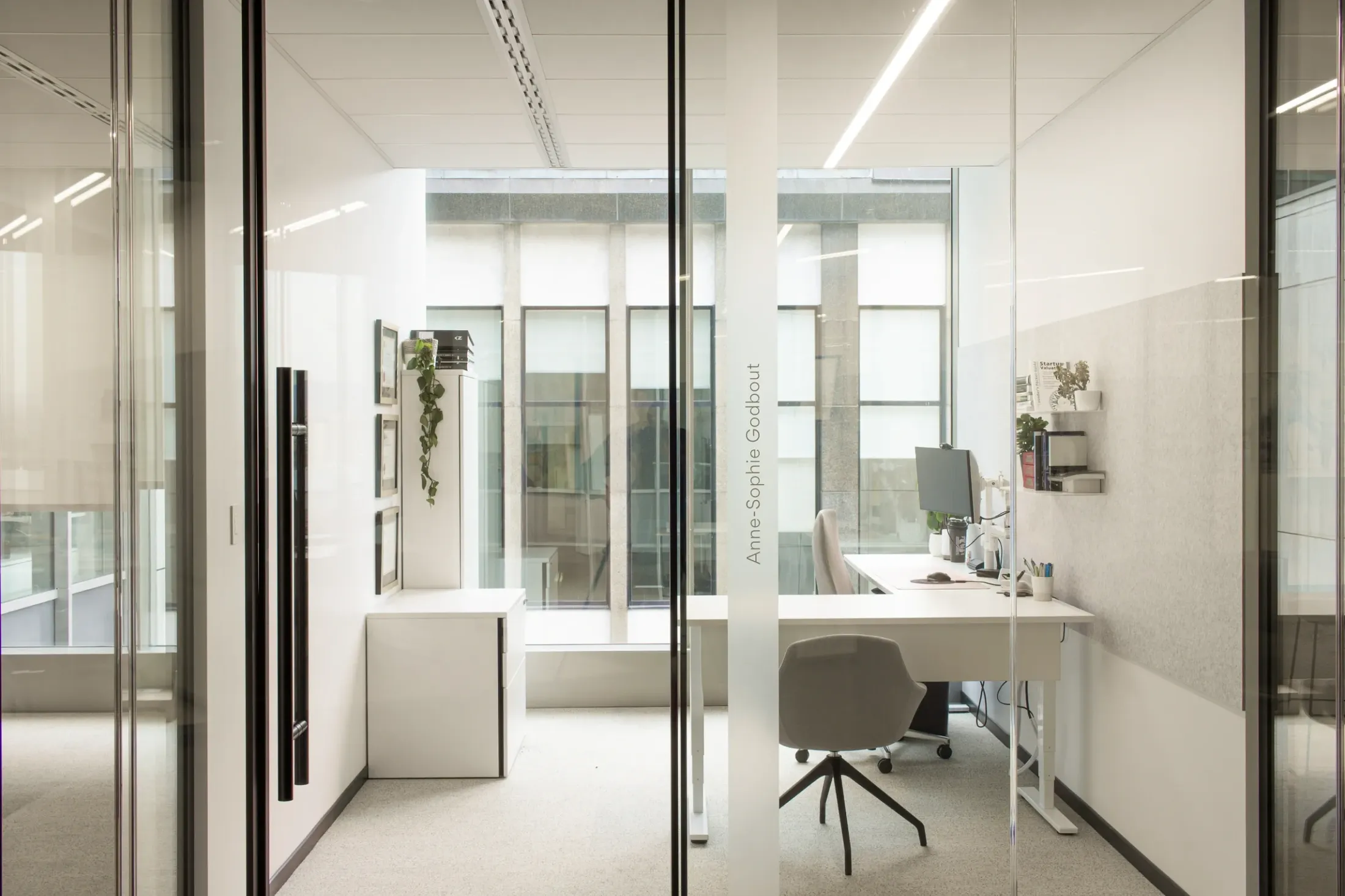
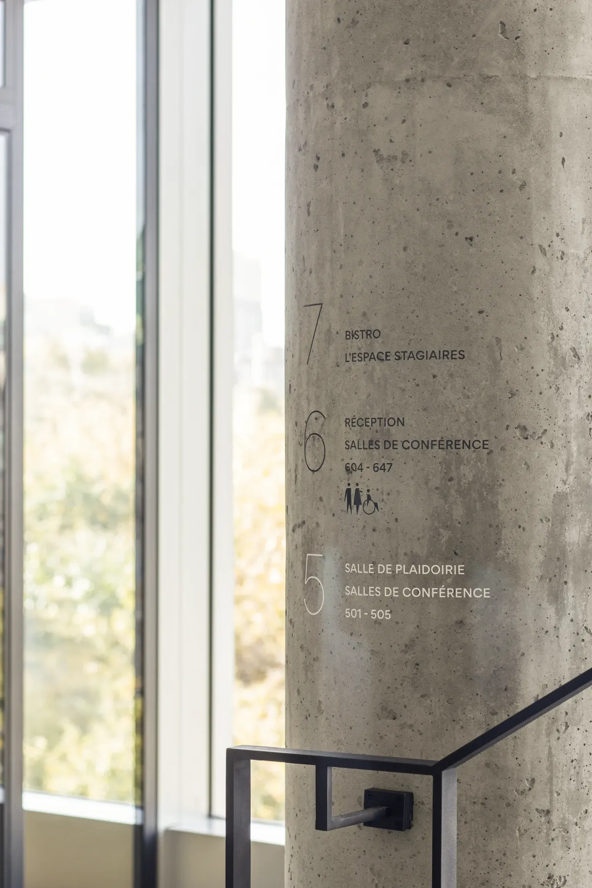
The same sense of refinement and precision emerges in the layered design of the glass surfaces, where room names blend seamlessly with the frosted background. The names appear to float within a frame of negative space, creating a modern and dynamic visual interaction that evokes openness, transparency, and a certain level of decorum.


A Nod to Québec’s Maritime Heritage
Each meeting and litigation room is named after an iconic ship from Québec City’s naval history. Between the reception area and the view of Gare du Palais, a printed artwork brings this concept to life. Designed and produced by LemayMichaud, it spans across a glass surface, balancing privacy with natural light. The composition, a photomontage of towering ship masts, is presented in a white monochrome palette, overlaid with fine vertical lines reminiscent of the wall finishes found in the interior design.