Headquarters for the CNESST

This mandate completed for a government agency’s head office was a major one in terms of signage integration.
As part of an interior design mandate, the signage component had a clear challenge: to guide the user through a space totalling 395,000 square feet, with more than 1,850 workstations, distributed over eight floors.


Inspired by architecture
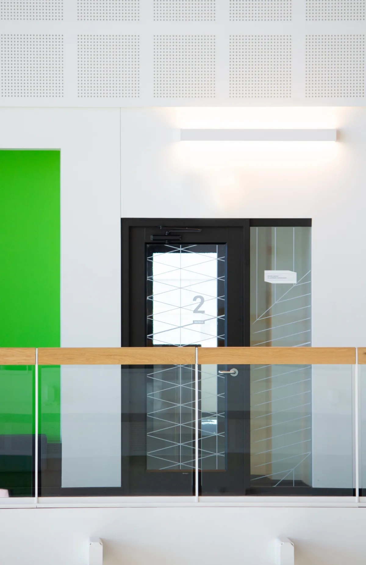
The design of the family and the signage system, as well as the pictograms, was inspired by a geometric grid composed of losanges.
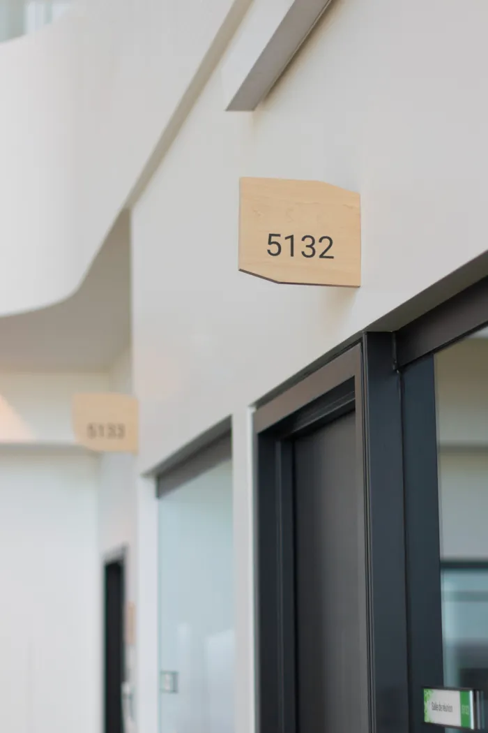
This motif is a reference to a particular feature that is strongly present in the architecture of the new building. In an effort to be fully harmonized within the visual environment, the shape of the panels is a nod to this same grid in an effort to extend the interior architectural language to the signage elements. Their shapes and dimensions are adapted according to the function while maintaining the basic principles of proportion. From simple room identification, they can be modulated to, among other things, the floor directory signs and suspended directional signs.

The signage strategy was adapted to the already established identification systems of the institution, emphasizing a more horizontal identification of the main sectors rather than vertical ones by floors. The latter are easily identifiable on their main access doors, through the application of seven distinct motifs designed following the concept’s grid.


The choice of materials was based on their seamless integration into the built environment.
The finishes used in this project offer a warm and luminous corporate atmosphere, in a minimalist style. For example, a wood laminate was chosen to complement the natural red oak, which is very present in the interior architecture. The same is true for the use of black and white, which will serve either to distinguish certain categories of messages or to ensure adequate contrast for the typographic elements.