Keurig Dr Pepper Canada
Signage Design
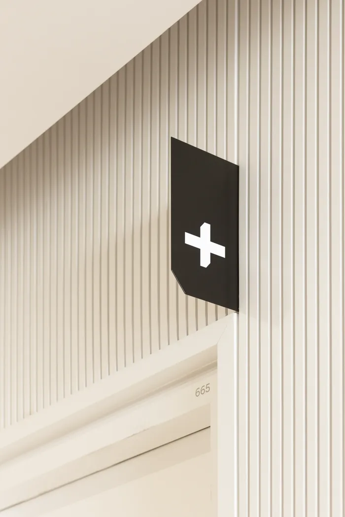
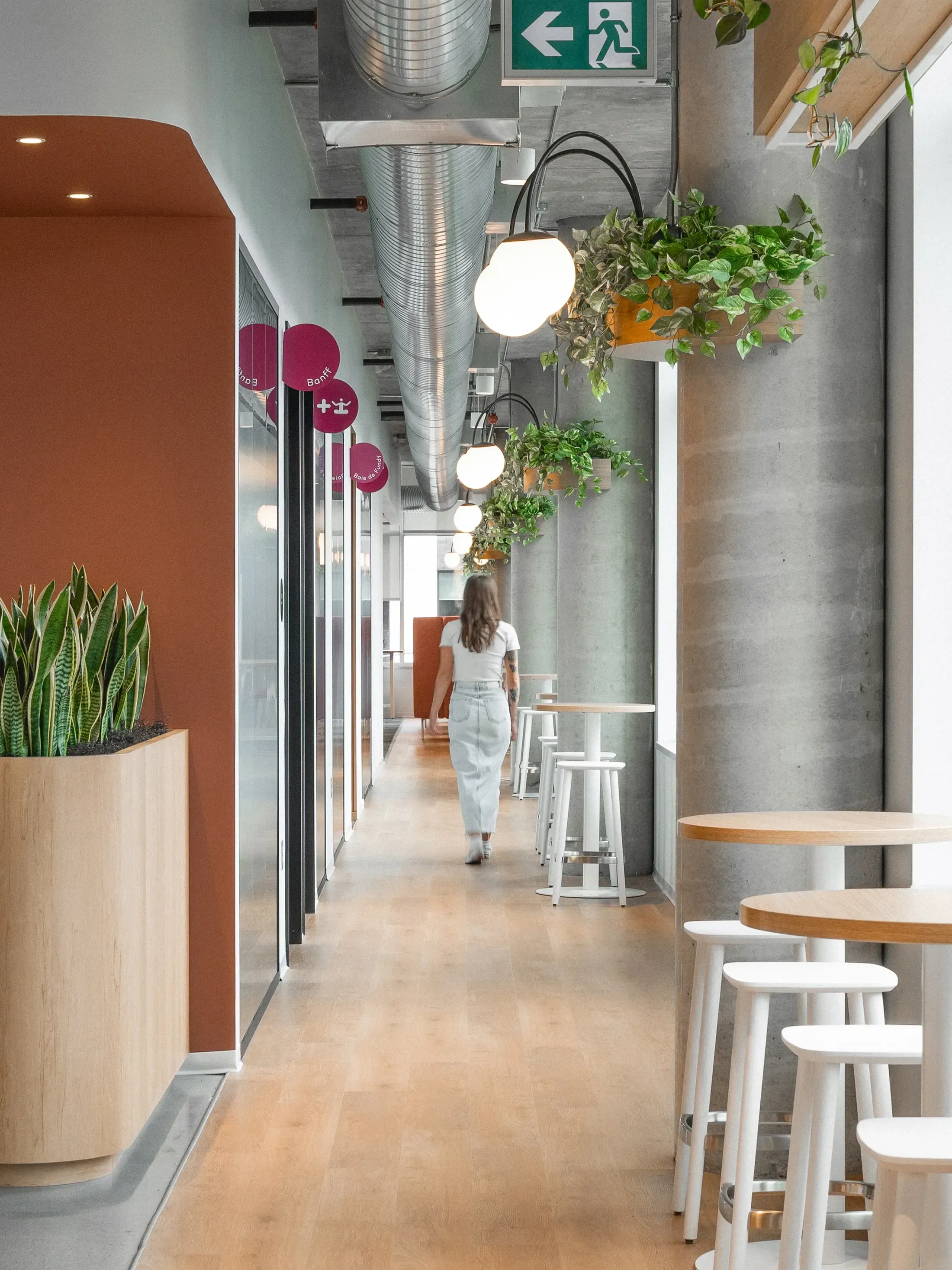
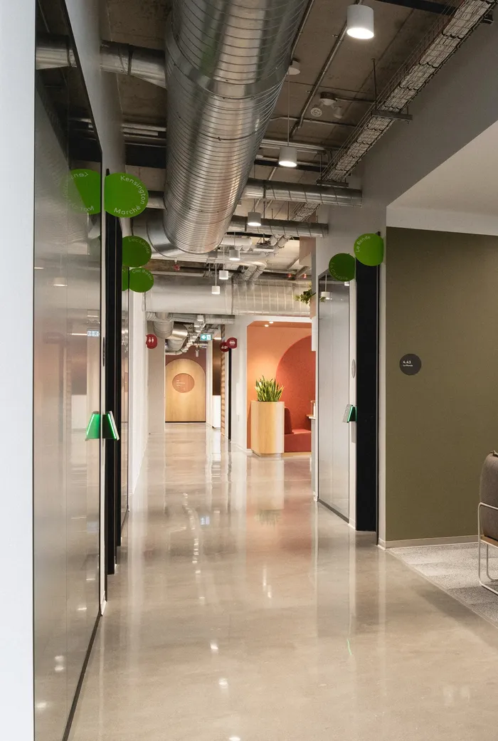
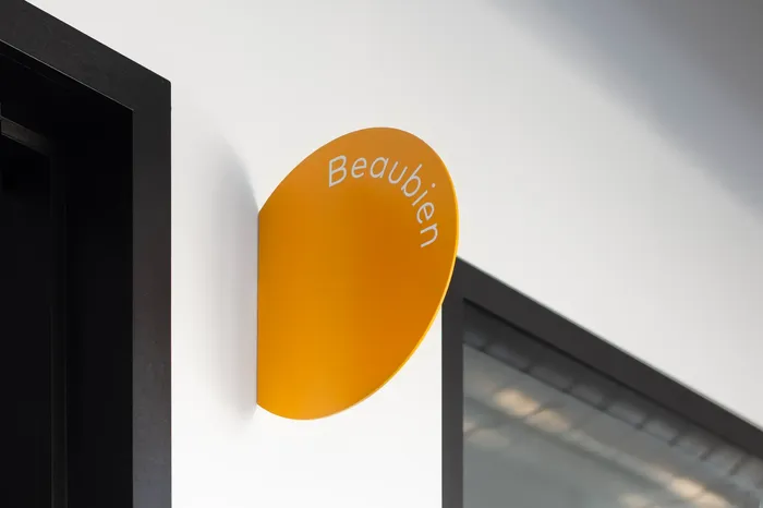
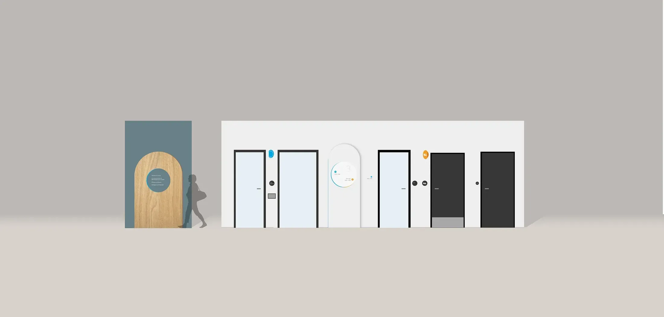
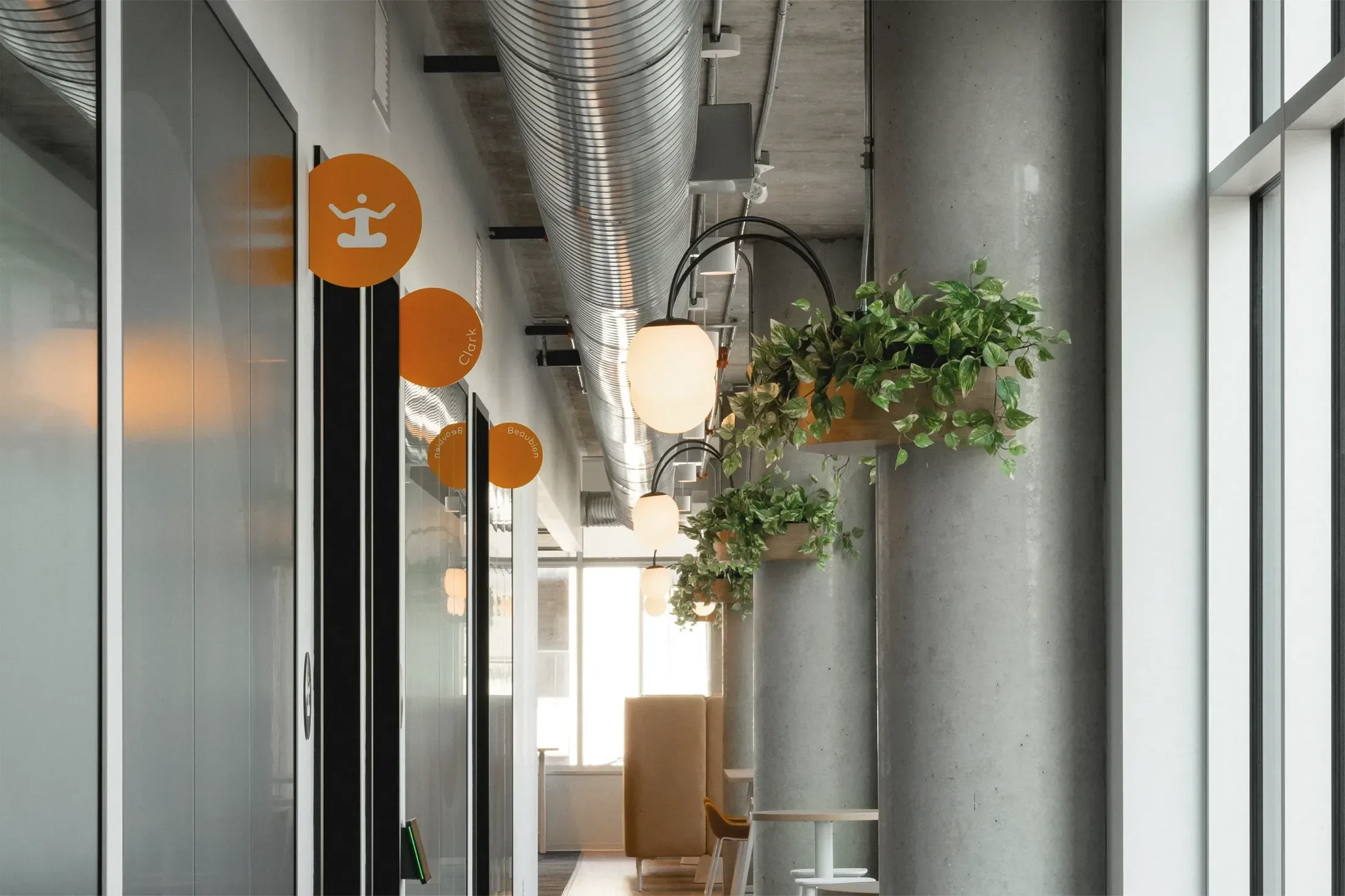
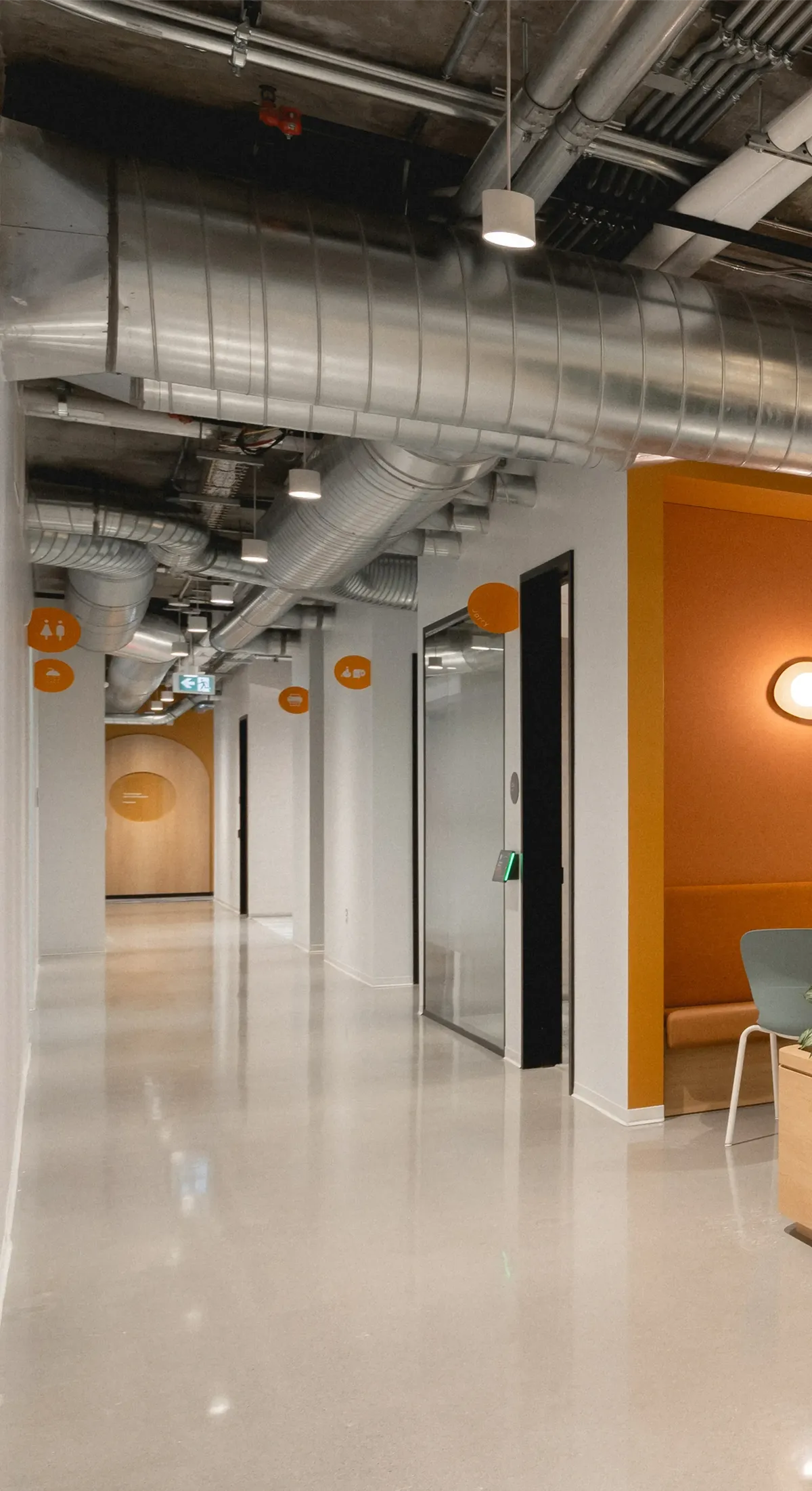
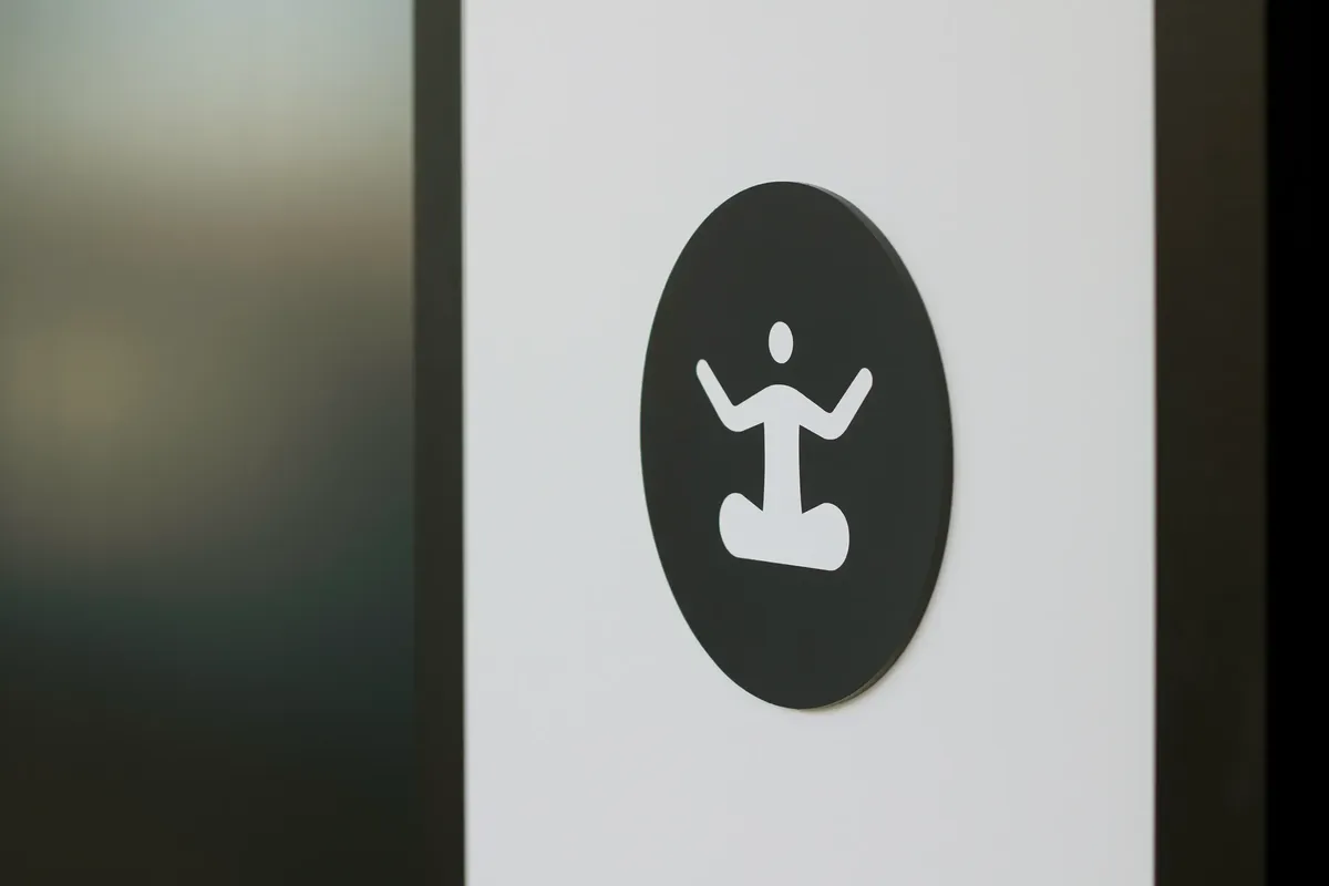
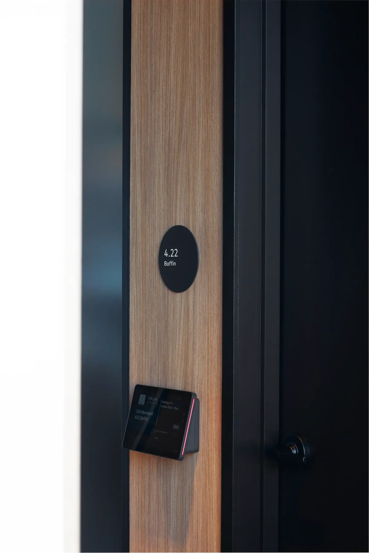
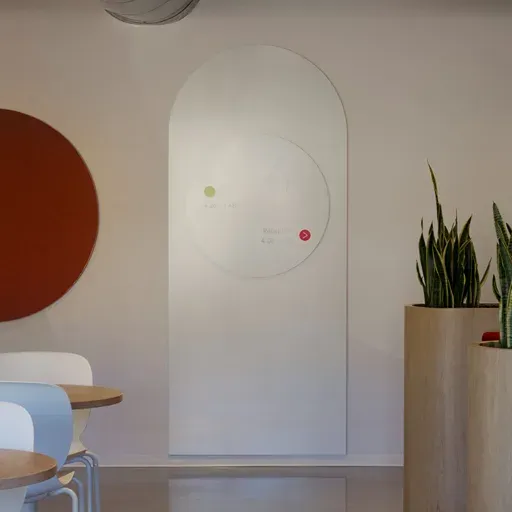
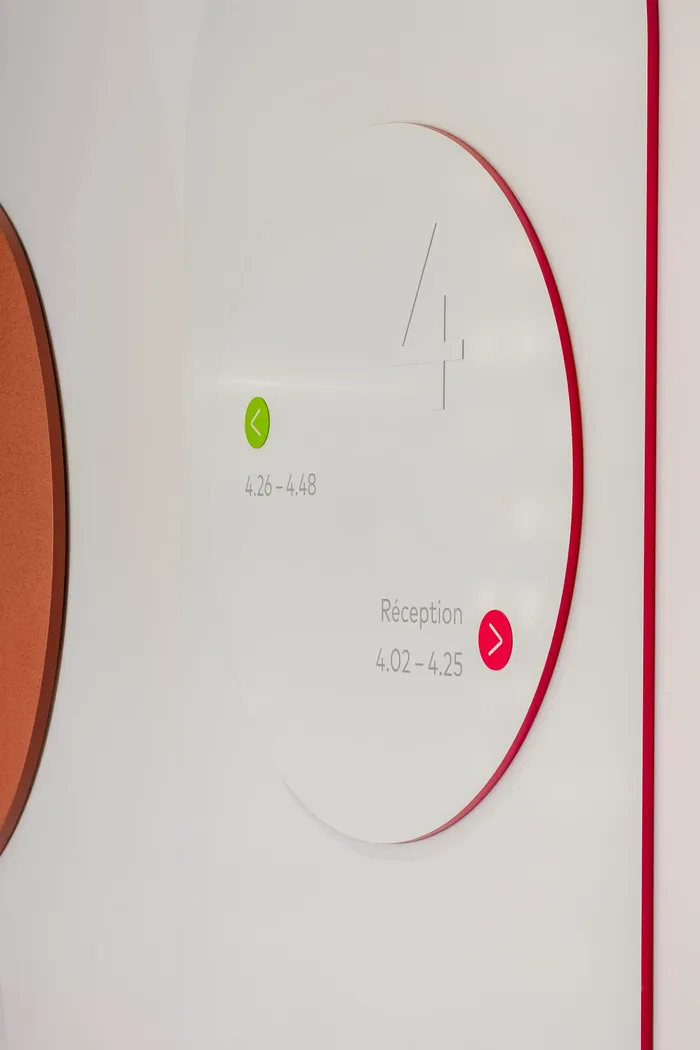
The signage, fully customized to reflect KDP's image, follows the established graphic direction, featuring identification, directional, and other circular-shaped signs. The pictograms also showcase curved shapes, in harmony with the overall aesthetic. Meeting rooms bear names inspired by iconic neighborhoods of major Canadian cities, with each room being identified by perpendicular signs tinted in the colors of their respective neighborhood. This approach not only reinforces KDP's local identity but also fosters a sense of belonging among employees.


Space Branding
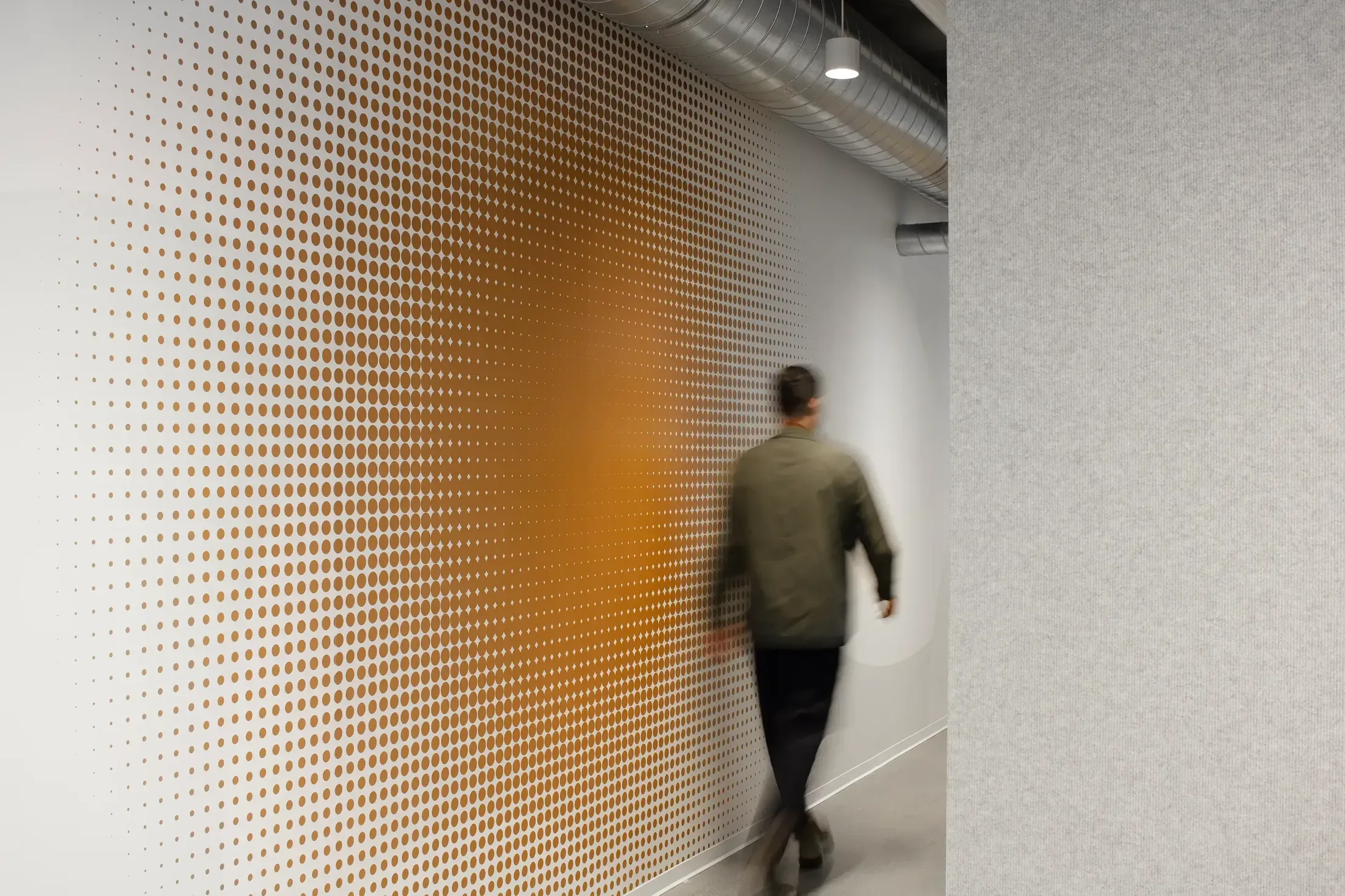
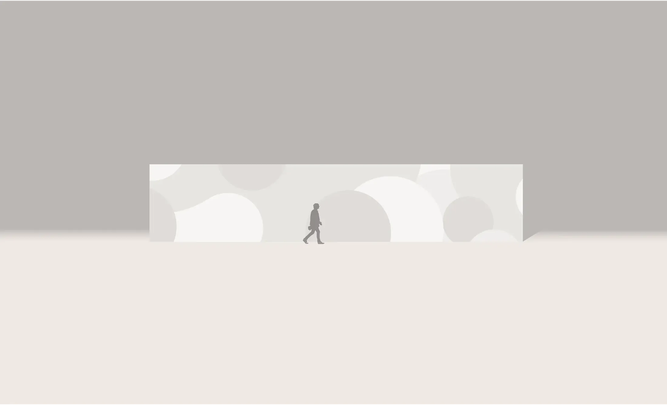
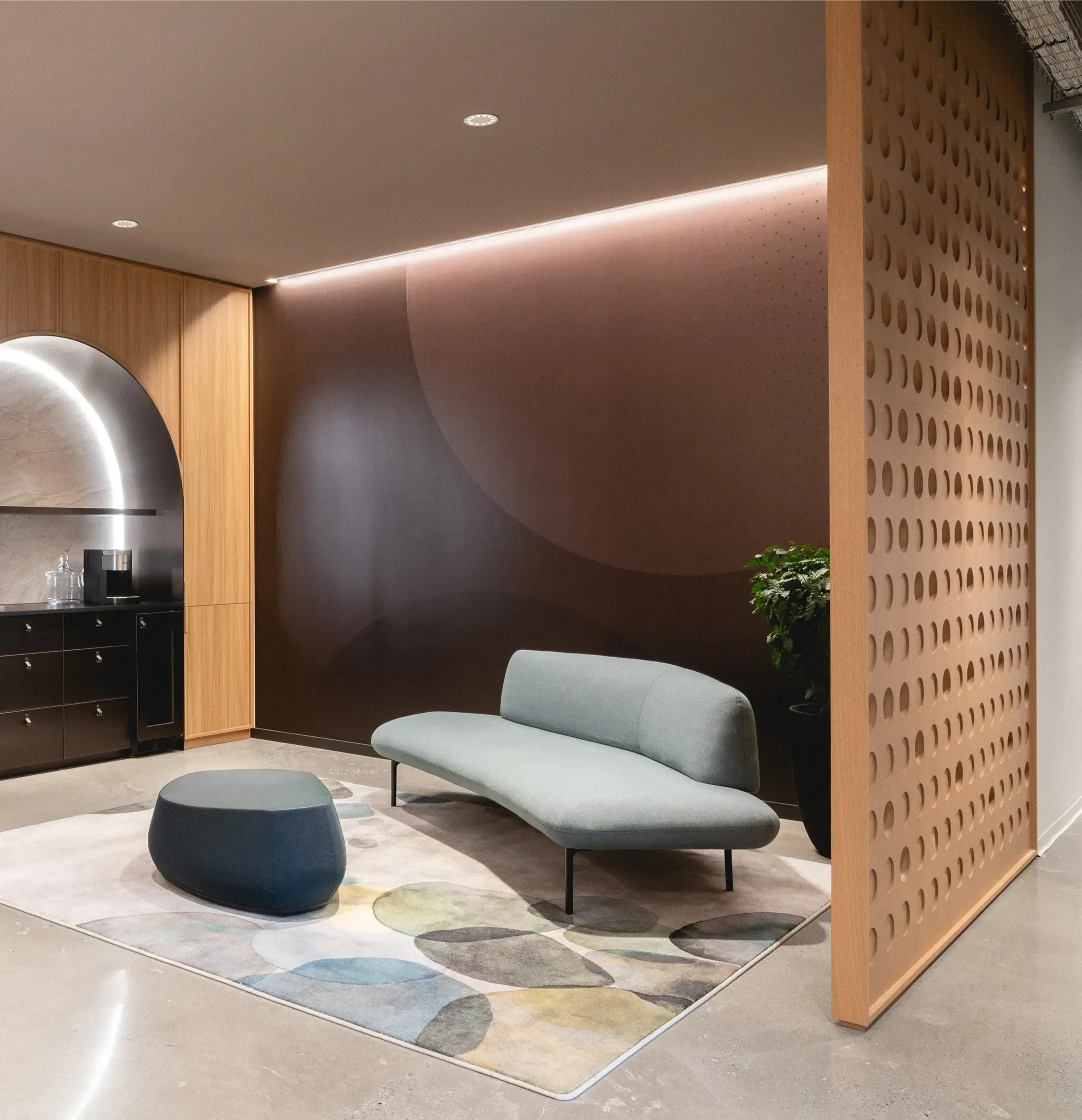
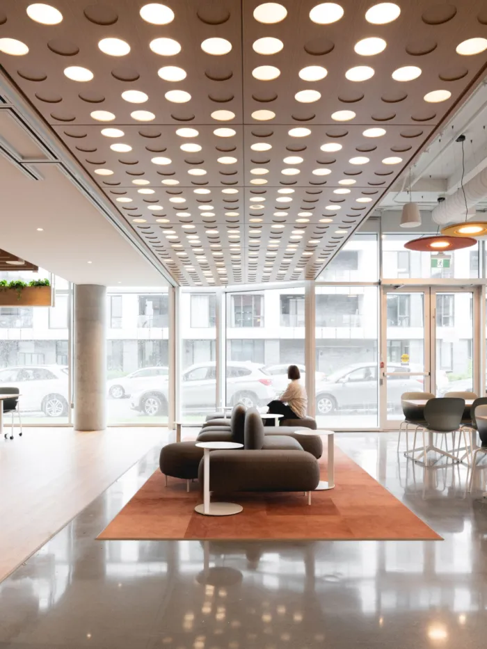
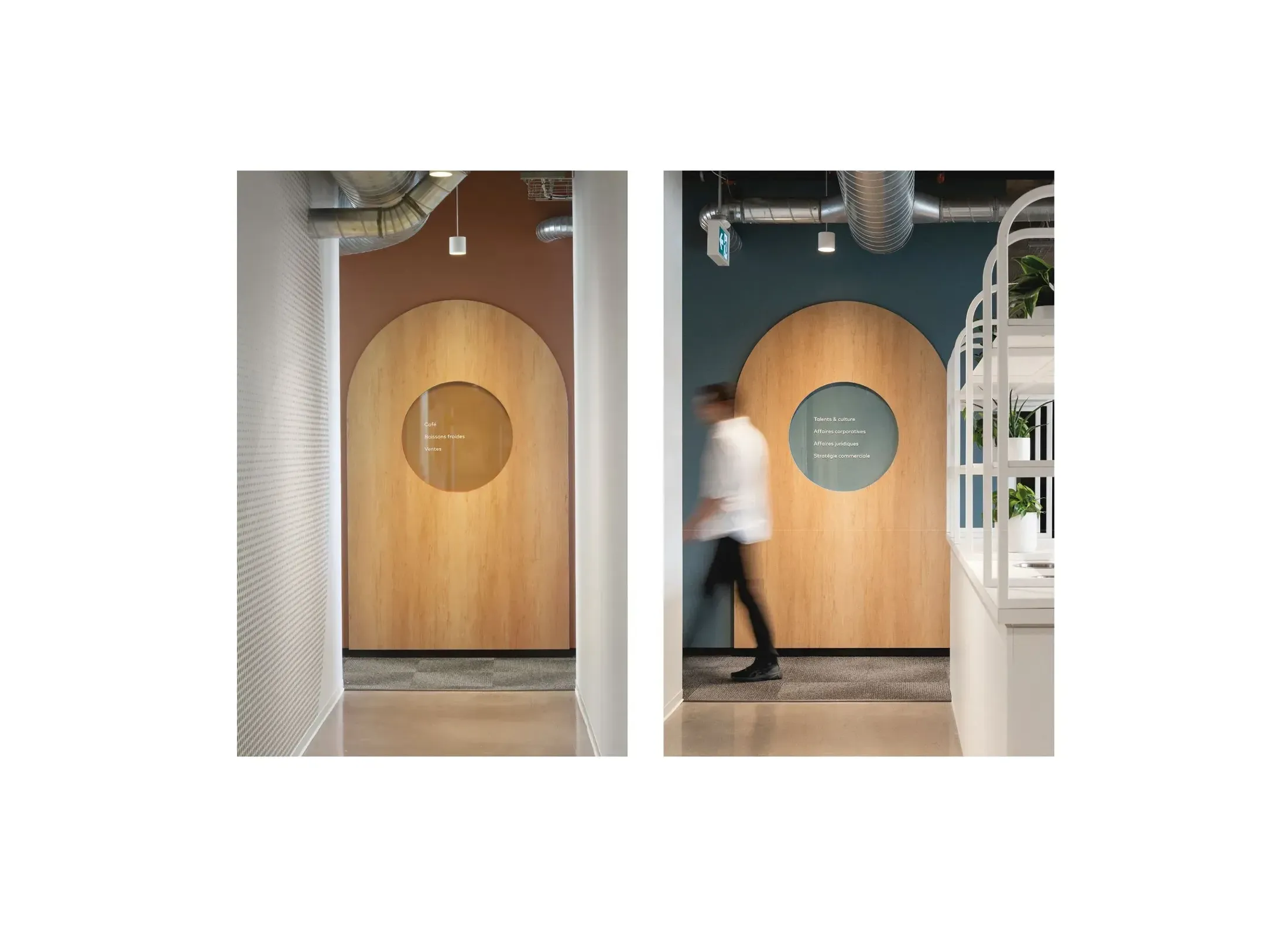
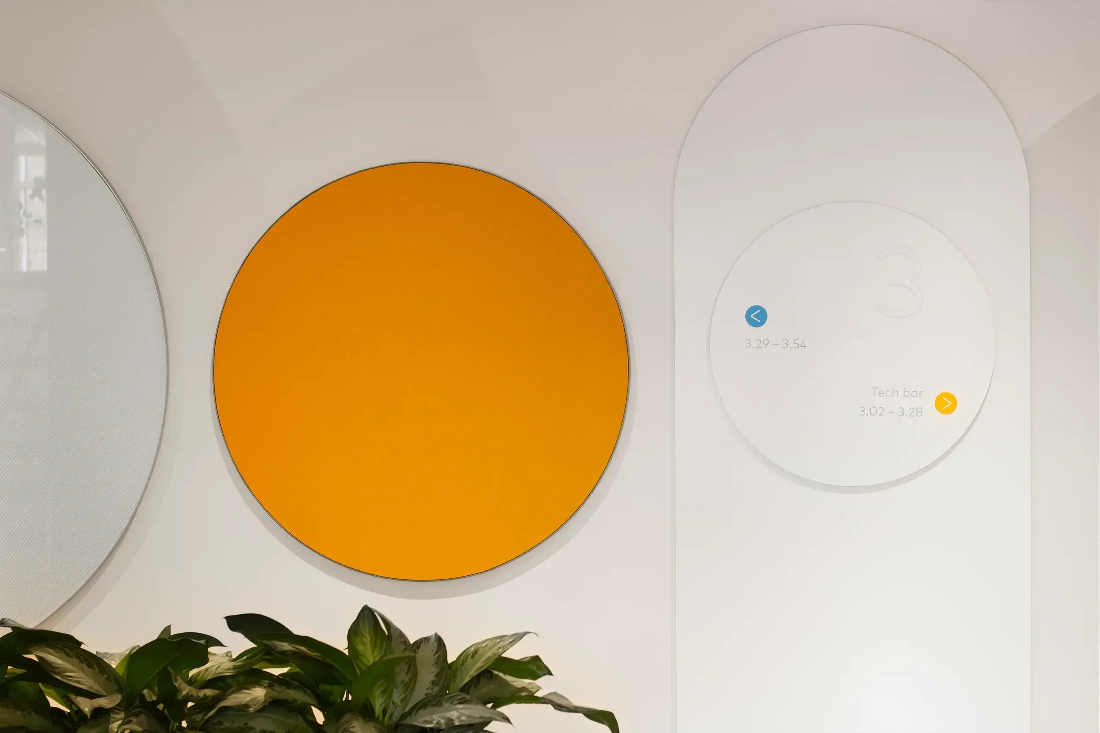
The environmental graphic design concept draws inspiration from the creative direction of the interior design, highlighting duality, contrast, and bubbles. These elements, reminiscent of coffee foam and carbonated beverages, are translated into wall patterns used along circulation routes. Printed graphic murals and customized privacy films enrich this visual interaction. The various areas are identified by KDP's colors, a principle that forms a central element of the wayfinding strategy, complemented by the numbering of offices and rooms.