
Simons Vancouver

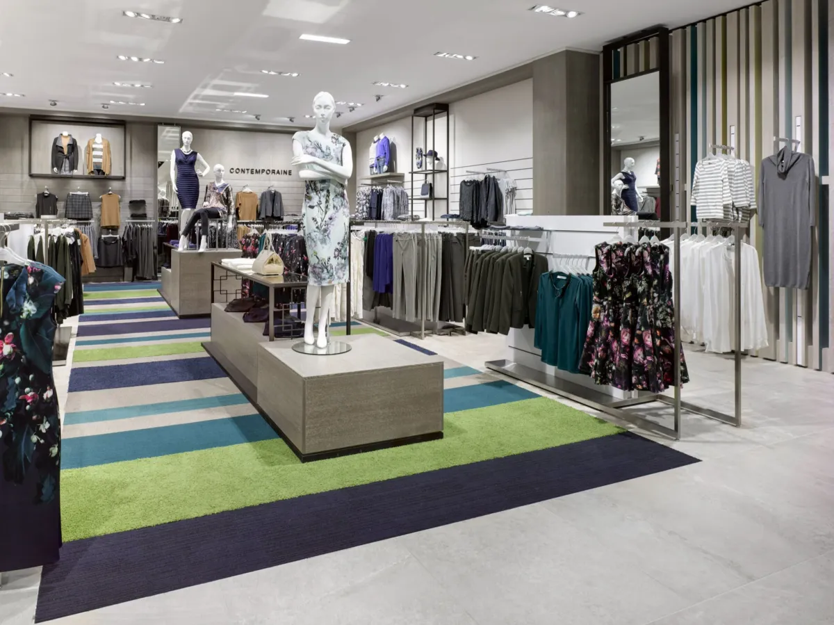
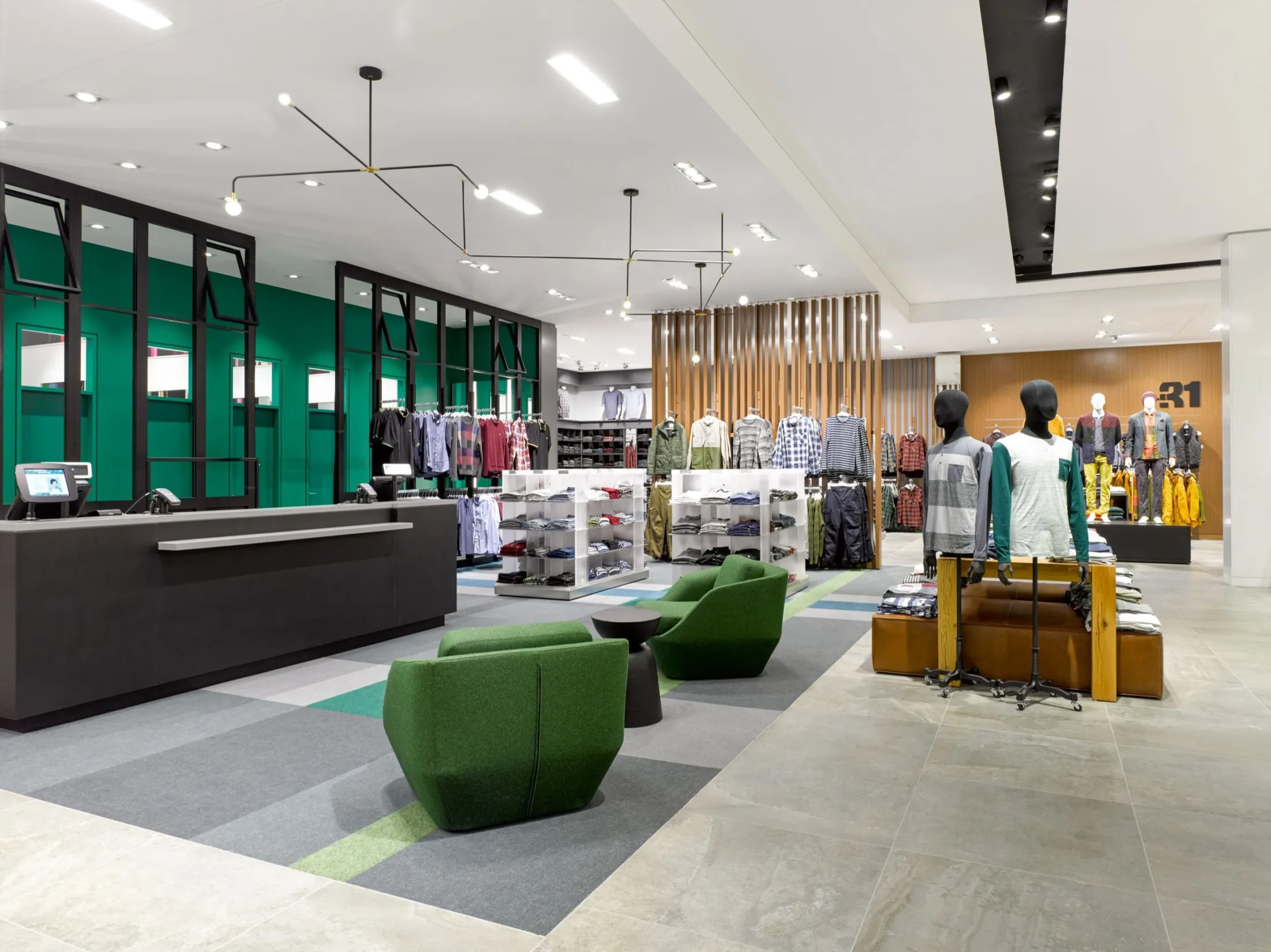
Simons stores have always distinguished themselves by their unique and exclusive architecture, each building having its own identity.
The architecture of Simons' Vancouver store is no exception. Comprised of two simple volumes, offset and interlocked, the layout and orientation define the architectural composition and dynamism of the overall structure. In the northern corner, the upper volume is offset and overhangs the bicycle path. It acts as a signal element and supports the store sign.

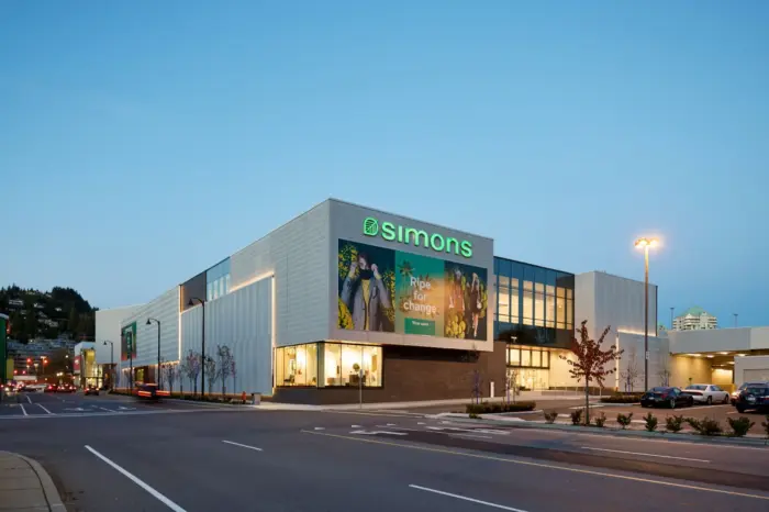
Its intersection with the lower volume forms the main north entrance, an atrium, and the Simons store window, both fully glazed on 2 levels. At their base is a large public square, a place for gathering and socializing. The high volume continues towards the east façade, where it intersects with the low volume to form another entrance.


The location of the Simons store in Park Royal, a site belonging to the Squamish nation, has a special significance linked to the site's character and history.
The design of the envelope draws its meaning from the origins of Salish weaving. Traditional Salish weaving is characterized by its off-white herringbone pattern, occasionally interspersed with black or red stripes. The proposed architectural cladding is inspired by this garment through a contemporary reinterpretation of the chevron pattern, molded and printed into architectural concrete panels. The choice of this material is not accidental, as its extraordinary plasticity enables the creation of a unique and exclusive pattern and in off-white color. The panels were installed as blankets stacked on top of each other, with patterns sometimes vertical and sometimes horizontal, on the building’s rough stone skin, evoking the origins and tradition of the Squamish nation.


Learn more about the project in Simons Vancouver website

