Meilleurs Regards
Developed as part of the expansion and interior refurbishment of a high-tech company’s offices, this art and photography installation brings to life a transitional space that connects the old to the new.
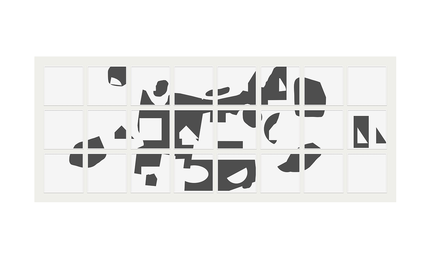
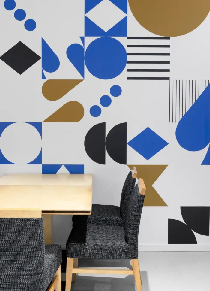
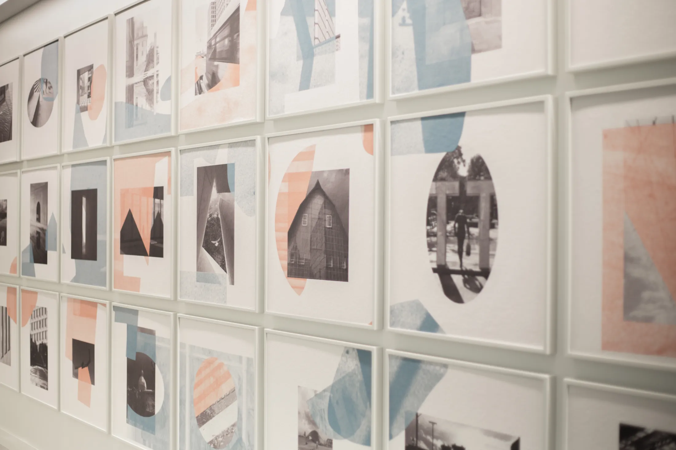
Entitled Meilleurs regards, the intention of the photographic work is to capture Ottawa’s street life through the eyes of the creators during a 24-hour stay in the capital. In total, 24 frames in which scenes of the city are distributed and sometimes combined. In a second reading, a graphic interpretation of the journey exposes an abstract form to the entire work. In a nod to the bilingual status of the city of Ottawa, the use of the colours red and blue symbolises the English and French languages. The designers also refer to this in the title: Meilleurs regards refers to their photographic vision and final selection, but is also a deliberately poor French translation of Best regards.

Form follows function
In addition to the aesthetics, there is a technical aspect to this installation: frames and pannels have acoustic properties. It is on these surfaces that the work comes to life following the combination of two printing processes, sublimation and screen printing on textile.